Heatmaps provide information about user behavior on your website. It tells about how users interact, where visitors click, how far down they are scrolling, and how long they stay on different areas of a page.
Understanding this approach can assist you in creating a more user-friendly and efficient website setup. You can use a data visualization tool called a heatmap to get this information. It gives you all the insights on which websites people visit the most and for how long.
This article will discuss the basics of the heatmap- how to use heatmap, the steps to create it, and how to read the heatmap data to make the most of it.
What are Heatmaps?
Before we know how to use heatmap, it is important to gain in-depth insights into what heatmap are!
In the form of colourful maps, heatmaps provide 2-dimensional data visualization. Colour maps have colour variations to represent different details by varying hue, saturation, or brightness. This colour change gives readers visual indications about the size of numerical data.
It is a mere fact that the human brain comprehends pictures better than numbers, text, or other written data. Thus, to make it easier for a human to go through the data, heatmaps replace numbers with colours.
What is a Website Heatmap?
A website heatmap shows the categories on your website in various hues. The “most popular” are shown in red, and the “least popular” in blue to depict how users engage with your website.
A heatmap compiles user interactions of a certain kind. For instance, it can track eye movements, mouse movements, and, to an extent, the users’ scroll.
A warmer hue, such as red, orange, or white, is applied to a location that receives a lot of clicks. Green or blue represent locations that are farther away and receive less attention.

How to Use Heatmap?
Knowing how to use heatmap is essential to understand your users and their interests or preferences thoroughly. Heatmaps use data visualization comprising different colours and tools, which help increase engagement, nurture customer relationships, and boost leads and, hence, conversions.
Let’s find out the compelling ways to use heatmaps:
- You can use heatmaps to test various prototypes and models to see how appealing they are to users. You can also see if they are meeting their needs or if users are acting in an intended way.
- Heatmaps collect data from enough users to show you common click patterns across your audience.
- Several factors that contribute to a positive user experience can be evaluated by analyzing the heatmap.
Note: These factors include navigation, user goals attained with fewer clicks, page layout, the type of images used, the colour schemes utilized, the size & form of the buttons, and the terminology used to describe the operation of the buttons. Remember, the length and language of the content can also be examined using heatmaps.
Heatmaps provide detailed, relevant, and valuable insights to optimize the models under inquiry if combined with methods like usage analytics and usability testing.
Steps to Create a Heatmap Tool
By now, you know how to use heatmap. The next important thing is to learn how to create a heatmap tool. By using the right tools, you will be able to create a heatmap effortlessly.
Most analytics and processing happen behind the scenes because heatmaps are designed to be used by people who aren’t trained data scientists.
Creating a heatmap requires a few simple steps. You can follow the below-mentioned steps to create your heatmap tool:
1. Choose a heatmap tool
Although coding a heatmap tool from scratch is possible, however, inaccuracy is significantly likely. Therefore, it is recommended to collaborate with a dependable outsider who can assist you in doing it correctly the first time.
2. Get HTML code
Locate the HTML source code for the website you want to study. Depending on your tool, enter the URL or select “View Source” in your browser and copy the information.
3. Mark up interactive components
The application should recognize all the interactive components your site employs, including buttons, links, and forms. However, they are recognized once imported into the heatmap tool.
If something is wrong or missing from the application’s list of tagged elements, you can modify it.
4. Start capturing interactions
The heatmap tool modifies your website’s source code with trackers that log each time a user types, clicks, scrolls, taps, or hovers their mouse.
Then, you can look at your dashboard snapshots to observe how user activity has changed over time with the help of maps like click maps, scroll maps, mouse tracking data visualization, etc.
Best Practices For Using Heatmaps
Now that you know how to create a heatmap, let’s learn about some of the best practices for how to use heatmap after comprehending quantitative and qualitative data.
1. Choosing the right color palette
The whole concept of heatmaps is based on colours, as users can understand colours better than numbers and the alphabet. The relationship between value and colour will most often take the form of a sequential colour ramp.
Here, brighter colours represent lower values, and darker colours represent greater values. You can use a deviated colour palette when values have a meaningful zero point.
2. Showing value in cells
Compared to other encodings like location or length, mapping color to value is less precise. As a double encoding of value, it is a good practice to include cell value annotations in the heatmap wherever required.
3. Using a legend
A heatmap must have a legend describing how the colours correspond to numerical values. A key is necessary for users/visitors to understand the values in a heatmap because the colour does not naturally correspond to value.
You can skip using the legend when the relative patterns of the data presented are significant rather than the absolute link of value to a colour.
4. Differentiate the levels by value or resemblance
Consider modifying the order in which the levels of the axis variables are illustrated when one or both of the axis variables in a plot are categorical. If there isn’t a natural ordering among the categories, you should pick an arrangement that makes it susceptible for the reader to understand the patterns in the data.
Typically, groups are sorted from maximum to minimum based on the average cell value for each. Grouping and clustering category values based on resemblance measurements is a highly sophisticated technique.
5. Choose the Necessary Tick Marks
There are options for organizing bins and displaying them in the chart’s numeric axis variables. Tick marks on each bin, similar to those found on a categorical axis variable, are acceptable if fewer bins exist.
It is preferable to plot tick marks between groups of bins to prevent congestion when there are numerous bins.
Questions to Consider While Reading the Heatmaps

Now that you have used heatmap to improve your website’s utility, you should be able to read and understand it to gain maximum insights about visitors’ behaviour. While reading the heatmap, you should consider these questions to comprehend the website heatmaps well.
1. Can your visitors see the important content?
Your website pages are filled with crucial information that your visitors can view. You can make changes to the website if they are not focusing on what is integral to it. Use a scroll map for this purpose. Before posing this query, you need to know some significant details.
One of these is the average fold position, which denotes the area of your webpage that is visible to visitors who land there without scrolling.
You should ensure that individuals immediately take in the most important information in this way. If they don’t, you must keep them intrigued so that they scroll down to view the vital information.
Another thing you can do is to confirm whether a considerable percentage of users are viewing particular page pieces or not. This is useful when working with lengthier pages, like the landing page, where you provide a lot of information.
The sudden shifts in colour should also be taken into account. They show that consumers have abruptly stopped looking for the information you offer. You need to know why there are quick hue shifts so that you can take the required step on a priority basis.
2. Whether your visitors click on the links and CTAs
People visit your website to learn more, subscribe to your services, or buy a product or service. You can use a click map to see if users are clicking CTAs, buttons, and links that will result in performing desired activities. You can see how much interaction these clickable elements receive with the help of click maps.
One advantage of this information is that it can provide a solution for possible design improvements. Use click maps to compare attitudes and gauge your new design’s effectiveness if you decide to change the webpage’s design.
3. Are non-clickable items causing confusion among your visitors?
As the non-clickable items appear clickable, these elements occasionally confuse your visitors. This can cause frustration among your visitors while they are trying to complete a task on your website or find any information. Consequently, they may switch to another web page.
It may result in the loss of several potential clients. Hence, you can improve once you ask these questions and read heatmaps frequently.
Where are Heatmaps Used?
Now you have all the insights about how to use heatmap, let’s move towards the areas where you can use the heatmaps.
1. Websites
Websites use heatmaps to display data on visitors’ behaviour and preferences. Using this visualization, business owners and marketers can see which parts of a website perform best and worst. It further helps increase the scope of improvement as they can optimize their website using these findings.
2. Business analysis
Quick visual clues about the outcomes, performance, and room for improvement are provided by a heatmap.
By analyzing the current data, heatmaps can identify areas of high activity that may correspond to the locations of most customers, places at risk of market saturation, cold sites, and websites needing a boost. Heatmaps can be modified to represent growth and initiatives in the future.
They can be used as ongoing analytics and integrated into the company’s operations and sales process. Heatmaps communicate the data to team members or clients in a more visually appealing and understandable manner.
3. Exploratory data analysis
Evaluating datasets before the modeling work is known as exploratory data analysis (EDA). Finding critical characteristics in a dataset by looking at a spreadsheet with numbers is laborious. As a result, EDA is performed to highlight their key aspects by using visual techniques like heatmaps.
Heatmaps are a great way to visually represent correlations between variables in high-dimensional space.
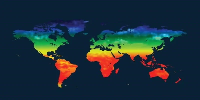
- Geovisualization
Geospatial heatmap charts can show how different geographic regions on a map are compared to one another based on predetermined criteria. Heatmaps are used in hotspot or cluster analysis to find areas with large activity concentrations. For example, you can use a heatmap when analyzing Airbnb rental prices.
- Molecular biology
Heatmaps are used in molecular biology to examine disparity and resemblance patterns in DNA, RNA, etc.
- Sales and marketing
Using targeted marketing, heatmap’s ability to identify hot and cold locations can boost marketing response rates.
Heatmaps make it feasible to identify underserved markets, client residences, and sale trends. It helps businesses maximize product ranges, increase sales, develop focused customer segments, and analyze regional demographics.
Advantages of Heatmaps
Using heatmaps on your website has several advantages. The traffic to your website and leads converting into real-paying customers are two of the important business goals that heatmaps help with. Besides, they allow you to have an upper hand by knowing the following:
- Can users access crucial information on your website, or are they missing it?
- Whether users are locating and utilizing the primary links, buttons, opt-ins, and CTAs on your web page?
- If inactive elements are sidetracking visitors?
- Are visitors having any problems visiting your website on several devices?
Final Words
Heatmaps are a fantastic tool for learning a web page’s specific details. You will be able to determine the importance of the content on your website based on the heatmap report. This will help you decide where to place links and vital content.
Knowing the visitor’s viewpoint with website heatmap tools can enable you to tailor your website to their preferences and improve their experience. Moreover, optimizing your website’s design, content, and functionality to better align with your visitors’ needs will help you boost conversions and drive revenue.
Vanshaj Sikri is a professional content writer, editor, and strategist for B2B SaaS, Digital Marketing, and Web3 domains. He specializes in crafting impactful blog posts to drive traffic, engagement and conversions.

